 Logo design plays a really huge role in any business. There is definitely no arguing about that. The logo that you use for your business should embody the essence of the personality of your brand. You have most likely put quite a lot of effort into your website and your logo design should be just as an important element. Though, you can rest assured as logo design does not have to cost you an arm and a leg.
If you are keen to tackle logo design on your own, here is everything that you must know about doing it yourself. When you pay close attention to the following things, your logo will be a real embodiment of your brand.
Grasp what good logo design entails
Great logo design is made up of a couple of basic principles. These principles include simplicity, versatility, timelessness, and suitability.
In short, good logo design is based on the idea that “less is more”. If it is simple, it will be more versatile and consumers will have a much easier time remembering it. Now versatility is important as your logo needs to look impressive everywhere. In other words, it must shine on bigger screens as well as smaller brochures and leaflets.
Although your logo does not have to depict precisely what it is that you are selling or providing, the logo must still manage to attract the attention of your target market successfully. In short, good logo design is suitable for the crowd that it is trying to attract.
At the end of the day, you should strive to design every logo as if it were to be the last one that your business will design. Thus, any logo must still look great a few years down the line.
Do not forget about your brand
For a logo to be great, it should embody your brand correctly. It is almost like a visual signature of some sort. Thus, do not be too hasty when it comes to conceptualization. Ensure that you grasp the identity of your brand and its colors, fonts and so forth.
Then, ensure that there is consistency. Your logo should be used for all your marketing. In other words, whether it is on a website, social media platform or printed on a business card, it should be consistent. Why? Well, when people spot the same logo in different places, they will feel much more familiar to you and closer to your brand. Now, if you end up using various versions of your logo, people will just end up feeling completely confused.
Look for the correct inspiration
If you want to guarantee that your logo at all times captures the attention, be sure to study all the latest logo design trends. So, it is definitely worthwhile to ensure that you stay clued up with regards to what is trending in the world of logo design. Though, this does not mean that you only have to browse logo after logo. Looking at typography and palettes can be an excellent source of inspiration too.
Draw the attention to your name
If you are the proud owner of a smallish to medium-sized business, it is really much better to opt for a logo that uses a graphic, but also includes the name of the brand. That way the chances that consumers will be confused are slim.
Yes, logos can only depend on a graphic without including the name of the business, but this type of logo design is most of the time used by only a few big companies that already boast a long history and strong identity.
If you would like to include even more text, you can add a tagline in addition to the name of your business too. If you are planning to go this route, just make sure that the tagline is catchy and a good description of your product or service that your brand is offering. Though, bear in mind that this extra bit of text can make things too complicated. For this reason, it should only be used when the tagline will truly give more info or help people to grasp your brand better.
Select the correct font
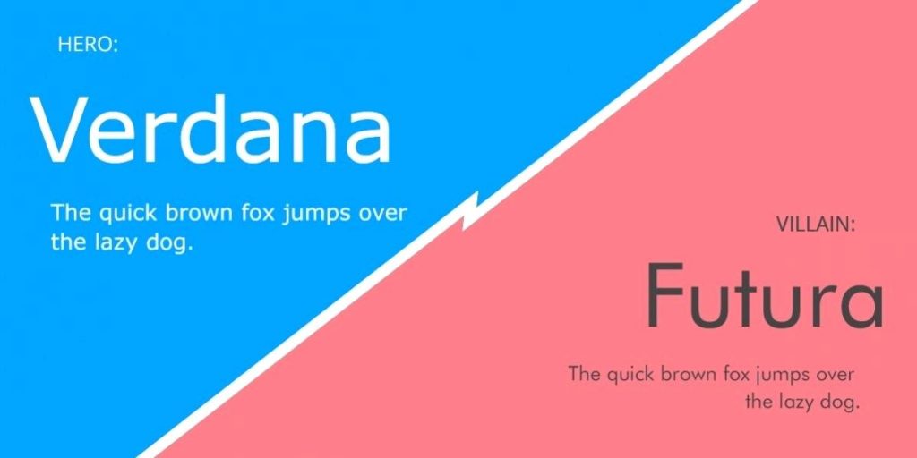
Typography can without any doubt communicate a lot! So, basically try to ensure that it remains simple. You will have to find the right balance between using a font that is unique as well as easy to decipher. You can definitely pick a font that is pretty, but the readability of your font should be the main concern at all times (and stick to only one font for your name and one for your tagline).
Why not ask your friends and loved ones to put your logo to the test? It can be a great exercise to get a few friends to read your logo via a couple of different devices. Then, use their (hopefully constructive) responses and make the necessary changes.
Experiment with color
When it comes to color and logo design, it calls for careful consideration. Different colors have the power to stir specific emotions within your consumers. For instance, red can stir feelings of excitement. Also, when your logo design incorporates a signature color, your brand recognition gets a serious boost! So, Magicdust recommends that you stick to maximum two colors and then add a complementary neutral color like light grey or charcoal.
Select your graphic
Graphics are central to logo design. In fact, it is usually the element that will capture the attention of your consumers first. When you are selling a product or service that is clear, you can simply use a graphic that is a good representation of your activity. Though, if your business is more abstract and does not have a specific product, it can be a bit trickier. In this case, you can opt for lines and geometric shapes to create a graphic. Then, once you have found the correct icon, be sure to resize it so that it fits in with your business name.


